
FBC Savoy 2020 Logo & Branding

Summary
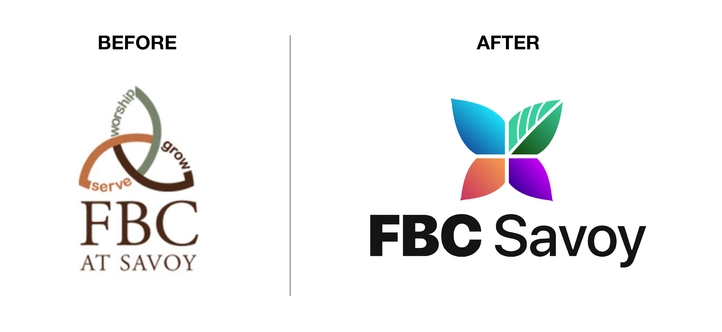
After being one of the youth interns at First Baptist Church (FBC) Savoy in the summer of 2019, I was hired by the church as a freelancer to redesign their church logo for the summer of 2020. From my conversations with them, it became clear to me throughout the process that they wanted something modern that communicated the idea of “transforming lives”.
Logo Symbol
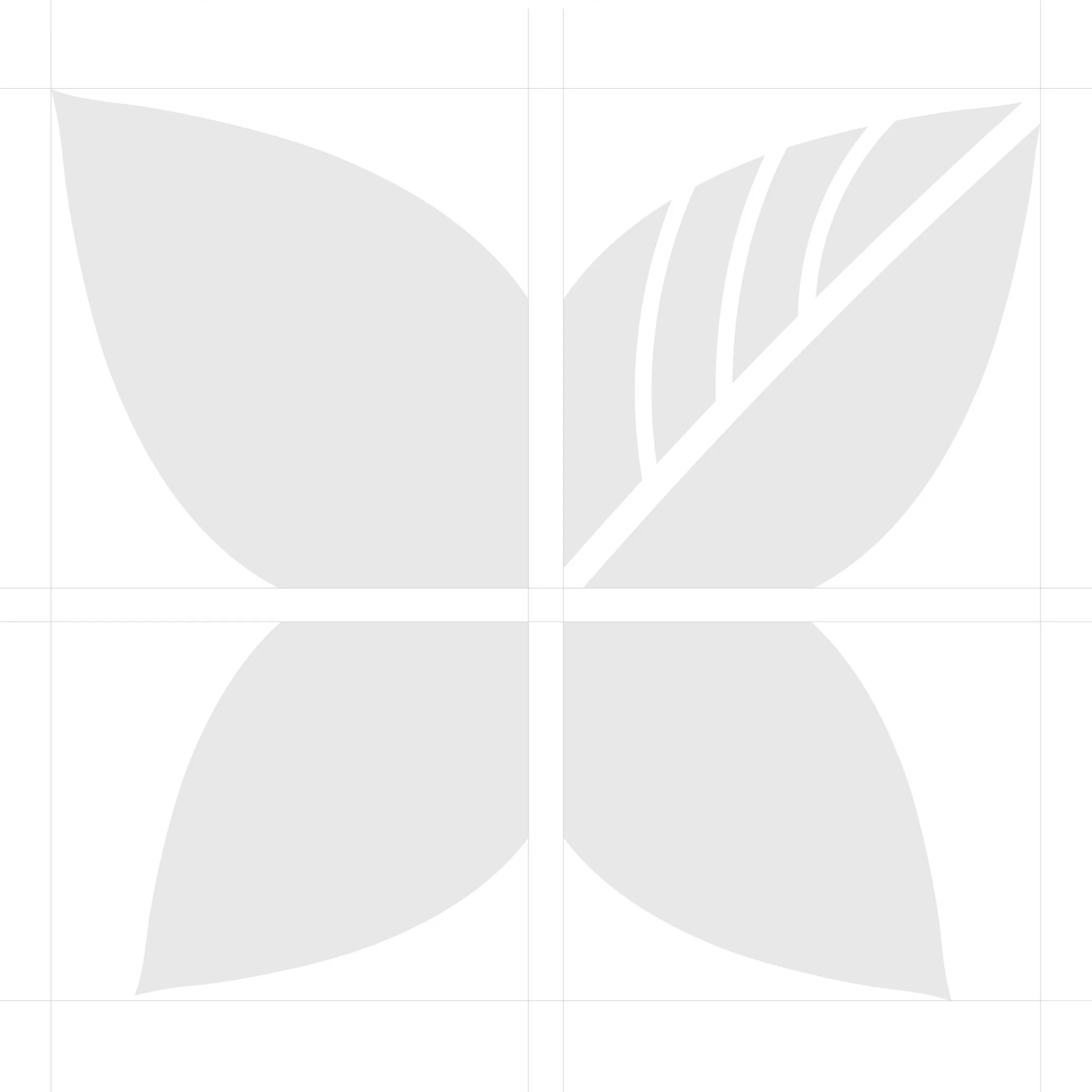
The FBC Savoy logo symbol is composed of four organic shapes that, by themselves, resemble leaves or petals. However, when these shapes are combined, they come together to create the wings of a butterfly centered in and growing out of the cross of Jesus Christ.
Logo Type
SF Pro is the typeface of choice for all FBC Savoy branding. Within this font family, SF Pro Display Black and SF Pro Display Medium have been selected for the logo type, and SF Pro Text Regular has been selected for the paragraph type.

Logo Wordmark
By combining the church logo symbol with the name of the church set in the selected logo type, we create a combination mark (or wordmark). This type of logo is extremely useful as both the logo symbol and the logo type work together to create a distinctly recognizable brand.
The FBC Savoy wordmark comes in three color variations—black, white, and color—and is extremely versatile as it comes in multiple horizontal and vertical orientations that can be used interchangeably, depending on the situation.


Color Palette
The FBC color palette is composed of four vibrant two-tone gradients, each representing a ministry within the church. Together, these gradients create a color system that the church can use to visually categorize their ministries and communicate their brand.


