Beyond the Breach (2019) Album Art
Summary
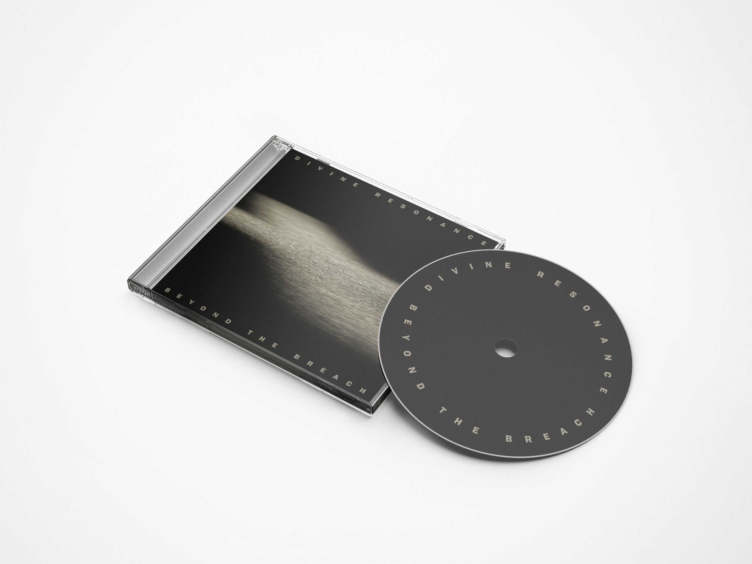
During the spring semester of my senior year of college, I worked closely with the band members of Divine Resonance to create the album art for their first full-length album Beyond the Breach (2019). Using multiple jewel case templates provided by Disc Maker, I designed the album’s front cover, back cover, six-page trifold booklet, tray card, and disc label. From start to finish, the entire process took about five months. I began brainstorming ideas in January of 2019 and the album was released on May 24, 2019.
The Story Behind the Album Art
Learning Opportunity
Near the end of the fall semester of my senior year of college, my suitemate and guitarist for Christian rock band Divine Resonance, Dan Leffingwell, approached me about designing the album art for the band’s new album, Beyond the Breach (2019). As he talked about it, I was immediately intrigued and, not entirely knowing what I was getting myself into, quickly agreed to work on the project as soon as I got back from winter break.
This was the first time I had ever worked on something like this before, so I didn’t know much about how to approach the process of creating album art, but I was excited to learn and would have most of the semester to work on it. As a visual artist and graphic designer, I looked forward to the opportunity to take what the band had already created lyrically and musically and explore what the same thing might look like visually. Looking back, it was a long, sometimes tedious process, but it was worth it. It was inherently collaborative, creatively inspiring, and a joy to work through.
Lyrical Analysis
Early on in the ideation stage of the creative process, Dan gave me a rough sketch of an idea he had for the front cover (see below) and a PDF with the lyrics of all the songs that would be on the album.
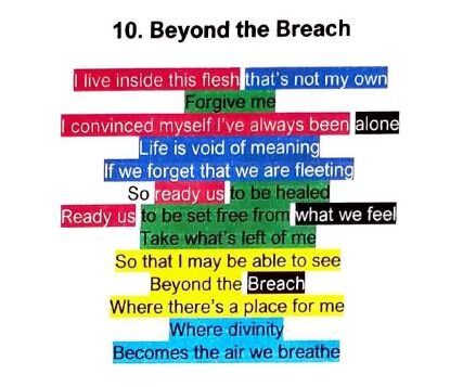
The first thing I did was to carefully analyze the lyrics, identifying and color coding key themes and repeated imagery (see below).
This helped me begin to think about how the various songs in the album fit together as a whole and what the story of the album might be. As I did this, it also became clear to me that my job would not be to create new ideas for the album art, but, rather, to work with and re-imagine the ideas that were already there. Light, dark, shadows, shame, war, hope, healing, pain, freedom, identity, purpose, grace—the album was already full of rich themes and compelling imagery. My challenge would be to sort through it all and select the primary theme or image that could be used to tell the story of the album.
The Breach
The weekend after I got the lyrics from Dan I decided to go to one of Divine Resonance’s band practices to get a feel for how to visualize the sound of their music. As I heard the song “Beyond the Breach” for the first time, I decided to look up the definition of the word ‘breach’ to understand the lyrics better, and what I found were two very different definitions:
an act of breaking or failing to observe a law, agreement, or code of conduct.
a gap in a wall, barrier, or defense.
When I asked the band members which kind of ‘breach’ they were talking about, I received different answers from different people. Initially, I thought this confusion could become a big problem. That is, until I realized, Maybe it’s both. In that moment, God gave me the sentence that would become the core message of the album:
Jesus became the breach.
I said it out loud to myself and immediately knew there was something there, so I thought about is some more, and the more I thought about it, the more it made sense.
The first definition of ‘breach’ describes sin: “an act of breaking or failing to observe a law”—more specifically, God’s law. Because God is just, this breach of the law incurs the judgement of God. However, because God is love, he chose to save us from our sin and the consequences of it by doing what only he could do. Becoming a man, he took our sin upon himself, and died in our place, bearing the punishment that we deserved. The apostle Paul writes,
“For our sake [God] made him to be sin who knew no sin, so that in him we might become the righteousness of God” (2 Corinthians 5:21 ESV, emphasis added).
In other words, Jesus became the breach. He became sin and died on the cross, so that we might be made right with God.
The second definition of ‘breach’ illustrates how Jesus is the one and only way back to God. When we sin, we not only bring judgement upon ourselves, but we separate ourselves from God, putting a wall or barrier between us. When he died and rose again, Jesus broke through that barrier that separated us from God and became the one and only way back to him. This is why he said,
“I am the way, the truth, and the life. No one can come to the Father except through me” (John 14:6 NLT).
In other words, Jesus is the breach. He’s the gap in the wall that leads us back to God, and it is only by accepting what he has done on our behalf that we can be reconciled to God.
When I realized all of this, I was blown away. And when I told the band, they too were blown away.
Jesus became the breach.
It was immediately clear to us that this simple but profound statement would be the key to unlocking the story of the album. Still, as I worked on the project, I struggled to find the image that would tell that story visually.
The Shadow of the Cross
Though I had a variety of themes and images to work with and a story to drive the direction of the design, for weeks, I struggled to see how everything could fit together to create one image. The cross was clearly an important Christian symbol that I could use to communicate the story of the album, but, out of respect for the content of the album, the last thing I wanted the design to be was cliché.
One thing my mind kept coming back to, as I worked, was something that lead singer and songwriter Jacob O'Marrah said about the song “Shadow” during the band practice that I attended. Referring to the last line of the chorus, he said,
“The ‘shadow we live in’ is the shadow of the cross.”
Later that same week, I brought up what Jacob said about “Shadow” to my design professor, Taek Kim, whom I would be meeting with regularly to talk about my progress on the project, and he mentioned the idea of making the shadow of the cross the light part of the image and everything around it dark—an inversed shadow, if you will. I was fascinated by the idea, so I wrote it down, but it wasn’t until several weeks later that this simple yet clever idea would inspire the creative breakthrough I was looking for.
The Moment of Breakthrough
As I brainstormed and sketched, searching for the image that I could use to visualize the story of the album and anchor the rest of the design, nothing seemed to be working.
In my sketches, I hoped to be able to incorporate the light and the dark, both definitions of ‘breach’, and the shadow of the cross, but how I was going to do that was beyond me.
Then I remembered what my professor had said about the inversed shadow of the cross. Thinking about how a light shadow might be created, I soon realized that the only way to make something like that would be to shine a light through a hole into darkness. Then, in a moment of creative inspiration, I took my pen and punched a hole through the surface of the page I was sketching on, creating a breach in the paper.
Lifting the paper up to the light, I then noticed that the paper I was holding had two sides—a dark side and a light side—and, the paper itself was the barrier between two fundamentally different three-dimensional spaces—a dark space and a light space. As light poured through the punctured paper from the light space into the dark space, a beam of light cast its ‘shadow’ into the darkness. Then, after shaping the hole into a cross, I took out my phone and snapped the following photo:
This simple, low-resolution image, filled with meaning, would become the foundation for the rest of the design.
Designing the Cover
After receiving the go-ahead from the band on the direction that I wanted to take with the design, I recreated the low-resolution image using black construction paper and the light from my desk lamp (see below).
Not wanting to give away too much of the story on the front page of the album, the image focuses entirely on the inversed shadow of the cross, giving the viewer just enough of the picture to infer where the light is coming from—that is, beyond the breach. The warm monochromatic tan color is designed to contrast sharply with the harsh darkness of the surrounding area, and the perspective of the photo has been skewed to give the image more depth of field and a stronger sense of reality. Noise has also been added, giving the image its grainy, gritty texture designed to illustrate Divine Resonance’s raw, rock band sound.
For the title, I chose to use Lost Type Co-op’s typeface Tofino Black because of its bold, blocky characteristics and good legibility at small sizes. Not wanting to distract from the image, the cover type acts as a picture frame, and the wide tracking is designed to contribute to the feeling of lostness and loneliness that the viewer feels before coming into the light. The other typeface used throughout the design is Roboto Condensed Bold from Google Fonts. Limited by space within the booklet, this typeface was extremely useful because of its ability to fit large amounts of text into small areas.


